the problem
What needed fixing?
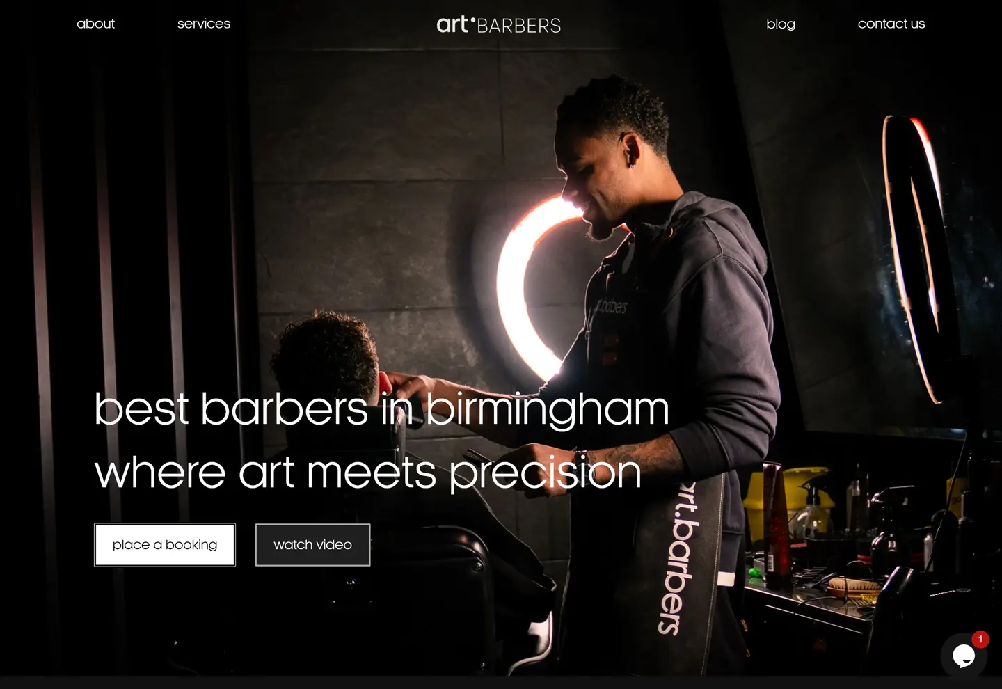
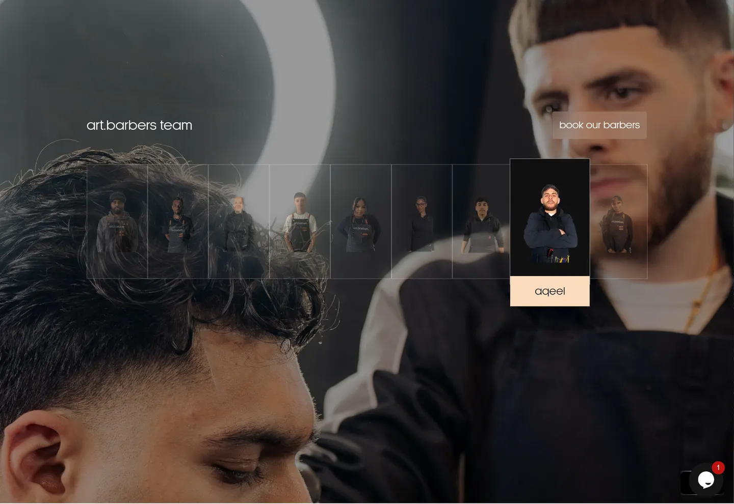
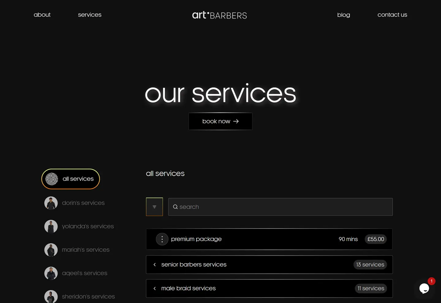
The website needed to communicate personality while making the practical parts — services, location and booking — almost impossible to miss.
open file →
A digital experience for a modern barbershop built as part of the wider Art Quarter ecosystem.
01 · the short version
The goal was to create a website that feels like the brand rather than another generic barbershop booking page.
the problem
The website needed to communicate personality while making the practical parts — services, location and booking — almost impossible to miss.
the approach
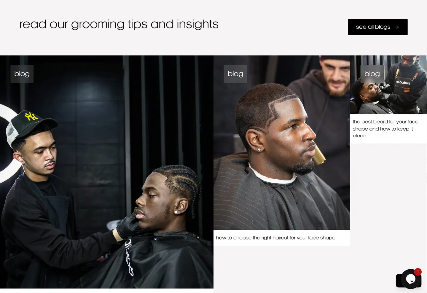
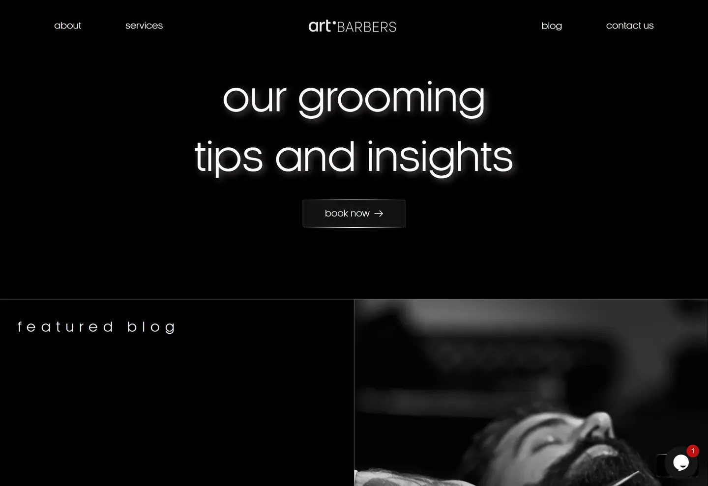
I used strong typography, visual hierarchy, movement and concise content to create a site that feels energetic without getting in the user's way.
02 · my part
Frontend Development
Animation
Booking UX
Responsive Design
SEO
03 · from the archive
04 · okay, but did it work?
The technical SEO foundation drove massive organic growth, generating over 90K search impressions, 5K clicks, and a 5.5% CTR within months. Using Microsoft Clarity, we monitored an incredibly low 0.15% rage-click rate across 4,500+ sessions, proving the UI was entirely friction-free.
I used strong typography, visual hierarchy, movement and concise content to create a site that feels energetic without getting in the user's way.
built with