the problem
What needed fixing?
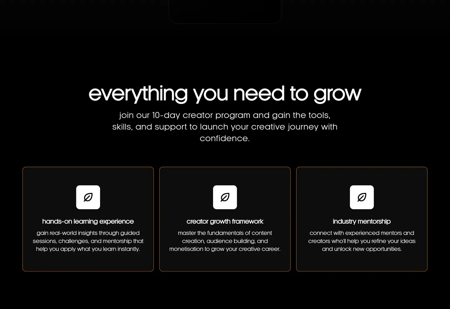
Programme pages can quickly become long walls of text. The challenge was breaking the information into digestible sections without losing the story.
open file →
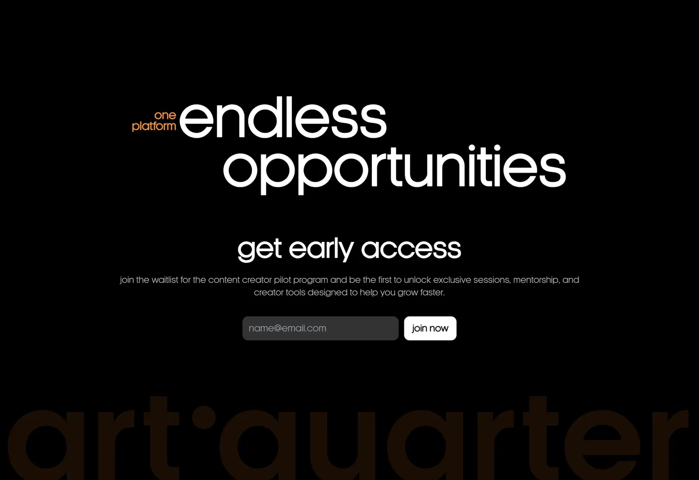
A focused landing experience for an Art Quarter pilot programme.
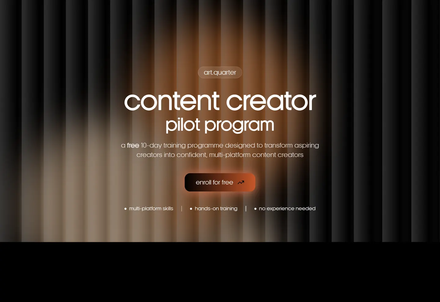
01 · the short version
The page needed to explain the programme clearly while creating enough visual interest to make visitors keep reading.
the problem
Programme pages can quickly become long walls of text. The challenge was breaking the information into digestible sections without losing the story.
the approach
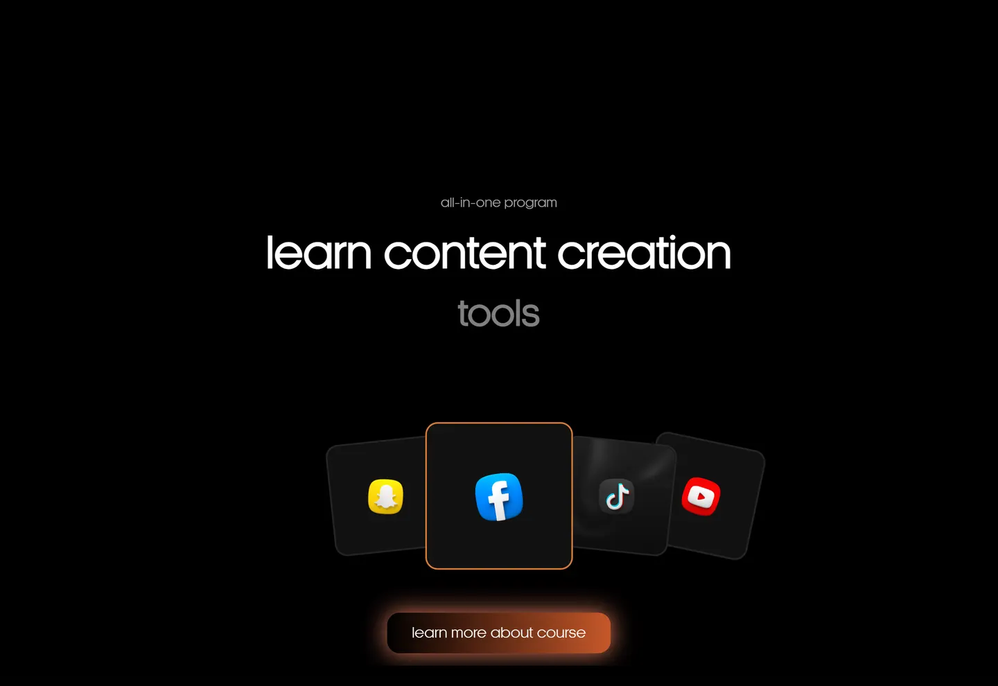
I used visual hierarchy, short information blocks, responsive layouts and purposeful interaction to guide visitors through the programme.
02 · my part
UI/UX Design
Frontend Development
Creative Direction
Interaction Design
03 · from the archive
04 · okay, but did it work?
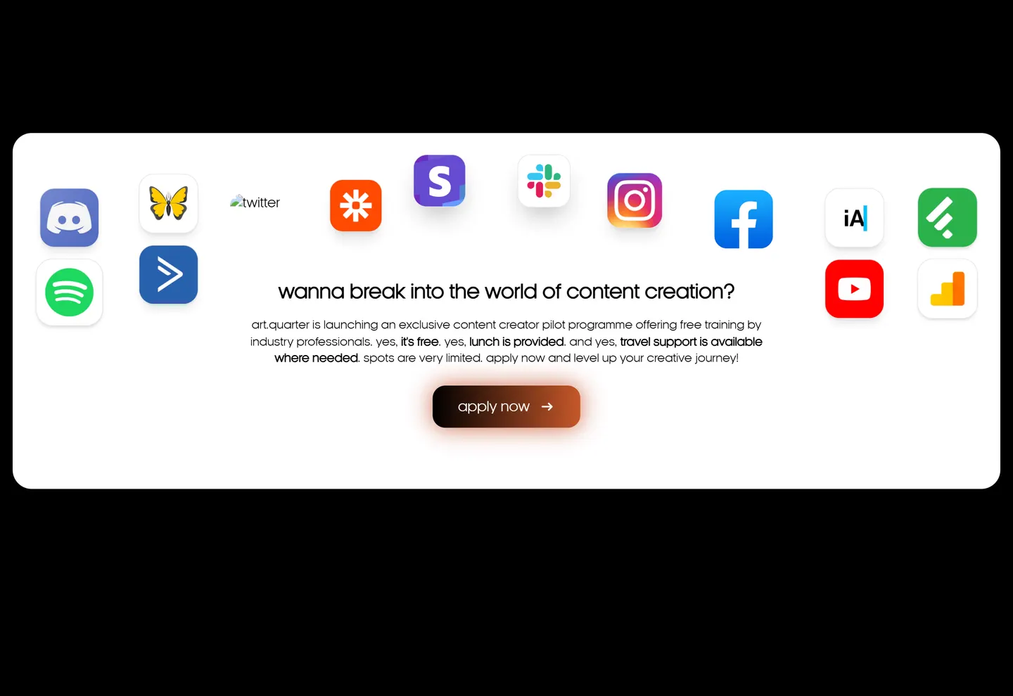
A structured, visually engaging program page that clearly communicates value and drives applications.
I used visual hierarchy, short information blocks, responsive layouts and purposeful interaction to guide visitors through the programme.
built with